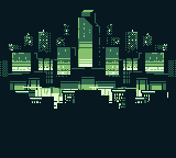
CRUSH GB
Game Update
CRUSH is now ANNIHILATOR
You can play the updated demo here: https://saltandpixel.itch.io/annihilator
You can preorder the physical and digital full game!
Visit www.saltandpixel.com/shop to reserve your copy.
Only for Game Boy Color
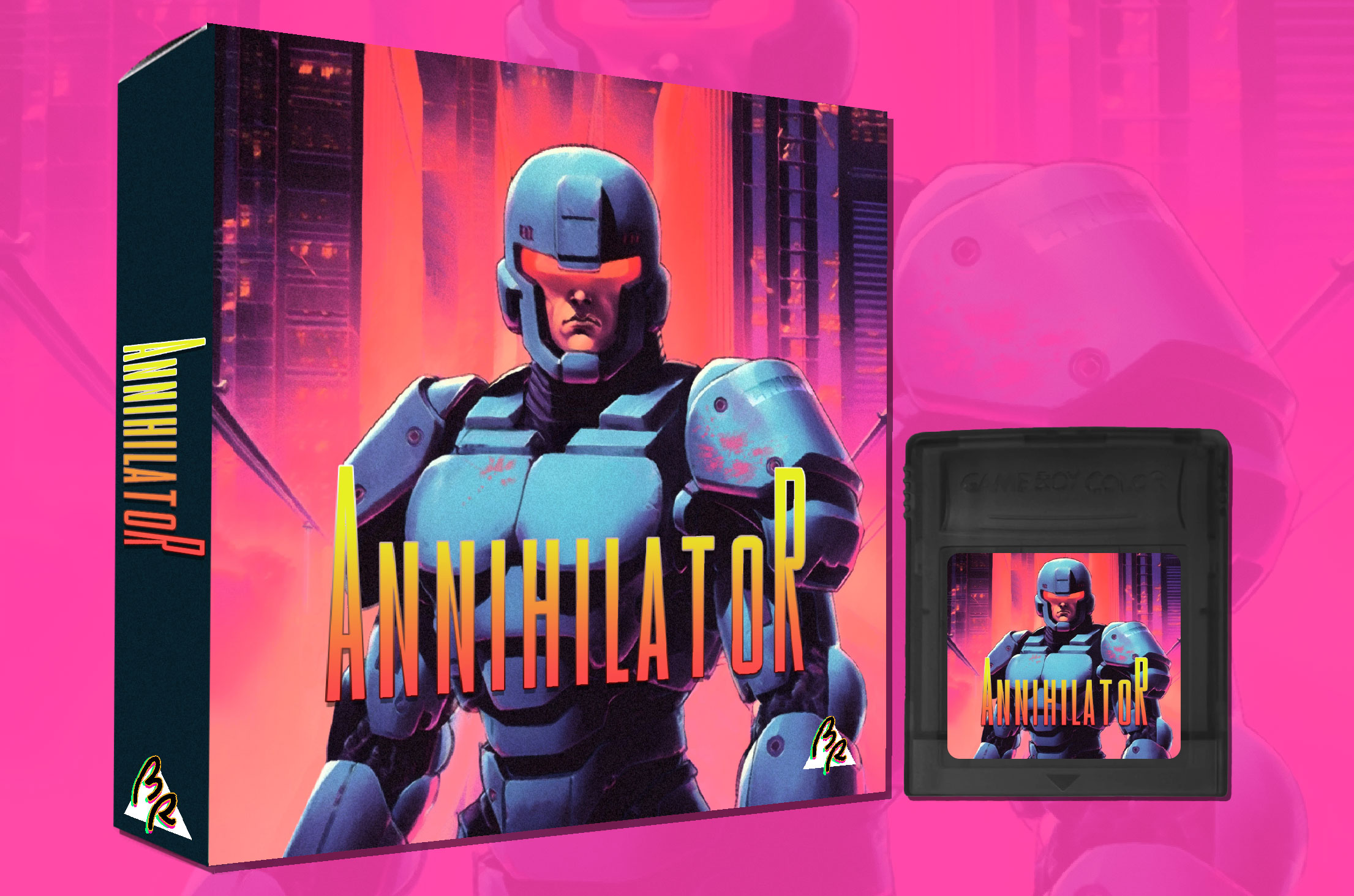
STORY
The year is 40XX. A war corporation, known as CRUSH, create enhanced soldiers.
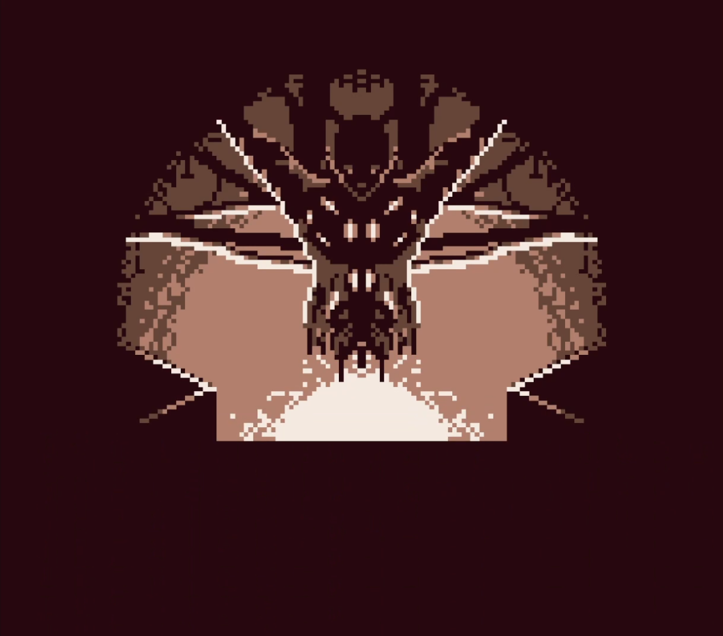
The organic properties of a cadet are replaced with cybernetic systems. Parts of the brain are replaced with bio controllers. Often against their will. The procedure is slow and painful. They are both alive and dead.
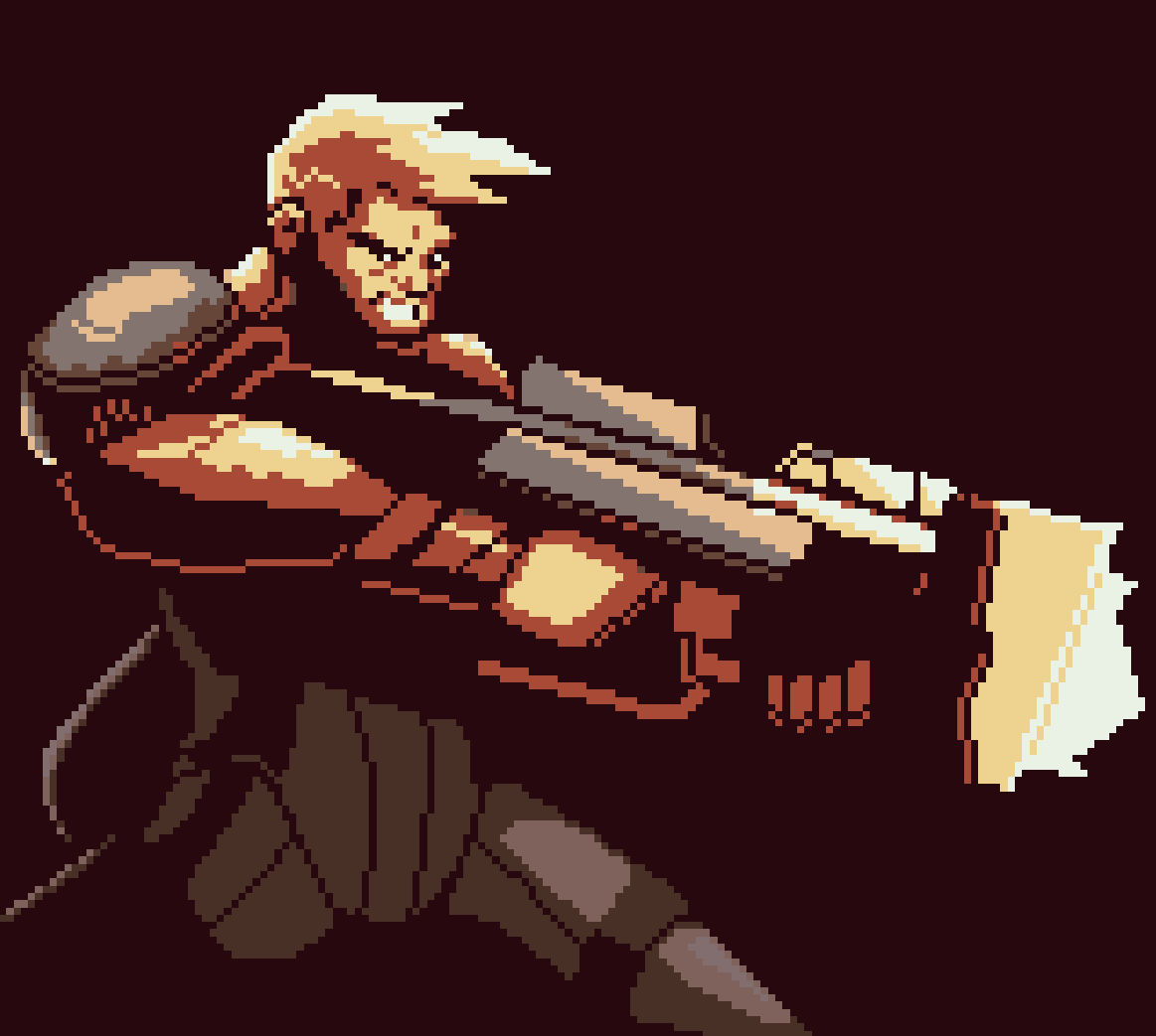
But one soldier has awakened.
Download
Download NowName your own price
Click download now to get access to the following files:
CRUSH_Demo_1.0.3.gb (Original Gameboy) 256 kB
CRUSH_Demo_1.0.3.gbc (Gameboy Color) 256 kB
Development log
- New Annihilator Demo ReleaseOct 11, 2023
- Pre-Order Launch and Name ChangeOct 02, 2023
- Update!! 5/24/2023May 24, 2023
- Upcoming Full Game Release!!Apr 30, 2023
- CRUSH Beta UpdateApr 03, 2022
- CRUSH 1.1.3 UpdateMar 12, 2022
Comments
Log in with itch.io to leave a comment.
how did you get this to run so smooth?! Every time i try to add more than 2 characters my game slows down like crazy
Hey!
In a single word: optimize
The trick is understanding when to place actions/updates with the CPU's ticks. Example is the enemy movement - I place a wait at the end of each update. One enemy as 0.4, another has 0.6 - It's a test and see kind of thing, but what you don't want is all your enemies moving on the same tick. Think of it like creating a drum track.
Another thing is hit animations - sprite switching on an update requires at lot more memory, than palette swapping on a hit.
Also, the CPU doesn't like camera movement while 2 sprites are overlapping.
You deserve so much respect !
What method did you use to have enemies spawn using gbstudio? I'd like to know since I'm developing my own gbstudio game. :)
You can't spawn in gbstudio. The object has to already be in the scene. In this game, the "spawn" is faked. What's happening is the enemies are being hidden, repositioned, and then showed.
Goddddd, this looks so good! Would love for a physical cart version!
Funny, that's what I was working on today. https://twitter.com/saltandpixeldev/status/1520519215823917057
😱😱😱
I'd be there to buy it day 1!
Nice work, fast and frenetic, great pixel work.
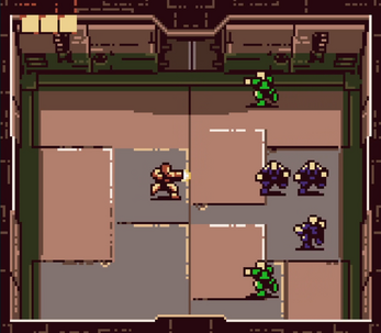
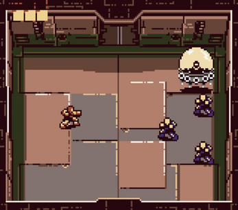
Really cool game, loved the commitment to the old aestethic. The art is fantastic, really nice pixel work, especially in the opening. The main issues I had with it were the enemies spawning on top of you at the bottom left and right doors, felt a little bit cheap, would like a bit of a warning like the top door.
Other than that, can't wait to see how this game develops, I included it in a recent video and would love to come back to it when it gets more updates.
I have some ideas about the sides. But I'm not sure if they will work. I'm limited on what I can do. I'm already close to maxing out sprites and frames. I may try palette switching and do a lighting effect around the door. As if a light is flashing. But my bg colors from floor to floor will start to look the same. Fun problem solving. First I need to figure out what to do with the B button.
This is a solid piece of work that feels like an authentic gbc game,with nice graphics for the simple gbc feel, decent music which could use a little more variety, but is appropriately intense. The gameplay is solid, though I do have a little constructive criticism to bring:
Having the player suddenly respawn to the far left when they take a hit and lose a life is a bit jarring; I think it's better to just leave them where they are as the invincibility works decently to protect a player, and perhaps the life icons could have a quick destructive animation (Just say 2-3 frames) so the player catches sight and recognizes they just got hit.
I think the player could be a hair faster, just by a tiny, tiny,tiny hair, as it's not too badly balanced now, but fine tuning it a little could help in the long run to feel a bit better.
Having enemies spawning instantly at doorways leads to annoying instant deaths, especially for the left,right and bottom doors which have no real indication that they are opening, which leads to some very cheap deaths.
Starting each level with exactly how many life points you had when completing he previous floor is a touch too frustrating, as continually restarting a floor with just a single health or two tends to grind a bit much.
I suggest having the player receive at least one life upon completion of a floor, perhaps at a cap of 3 and no more, only allowing the player to gain more life through those small green powerups.
Critique aside, this is quite fun and it has some good promise.
Oh yeah, you've made some good points. Some of them have already been implemented with the beta.
Awesome! ❤️
Is it intentional that it's a GB file (not GBC)? I opened it in DMG mode and it seems to run at about 50% speed, so it seems like it's meant to be a CGB exclusive maybe?
It's the file that gbstudio creates. It doesn't give me an option for any other type of rom.
You can rename the file extension to .gbc to lockout use as a gb rom. (I think that's the case)
Or place an IF color mode enabled == false, then take the player to a scene that tells them the game is for use with GBC only. That's what I did in CUPID.
Knowledge is power.
Just realized this may answer a question I was looking for an answer to.
If I wanted to do two versions of a game for GB and GBC, I would need two different builds?
Not necessarily, you could do the whole thing in one project using the IF color mode enabled statement to send the player to GBC only vs GB only scenes. its an interesting idea actually. Never thought of that until you prompted it.
Had a look on the speed issue and it seems its because the DMG has a slower CPU causing hard slowdowns. You also have slowdowns on the GBC when there five or more enemies on screen. It can be done without slowdowns but not in GB Studio. Nice artwork and game!
Fantastic art direction and sprite work. I was killed on contact with a trooper coming in through the left door. They appeared once I cleared the room as a next wave and spawned on top of me. What about placing a flashing "!" or something next to doors that will spawn the troopers for a brief moment before hand. It can act as a telegraph to avoid those insta- kill situations and the player can get out of the way in time.
Really nice arcade action with the screen shake, enemy AI and attention to detail on the sprite effects. Well done.
Maybe only 1 or 2 doors should spawn enemies for a given room. I'm looking at other similar games and I think that's how they make it work
Yeah, you could do 1 door to solve the problem but I think the gameplay would become a bit too predictable. It's fine to have enemies come from any door I think, just as long as its telegraphed. Doesn't even need to be an arcade style "!" which can admittedly be too obvious sometimes. Like the door opening with a bit of light shining in before they come out is enough to telegraph the oncoming enemies with a bit of nuance. making sure the player doesnt find themselves having an enemy spawn on top of them during battle is a problem to solve for sure in any case.
Another potential solution would be to put "yellow paint stripes" surrounding the area at the doors where the player is at risk of not having time to react when the troopers storm in. Like a hazard zone baked into the background layer. Then the player knows they are at risk by standing there.
Amazing homebrew. An good action game.
The art is excellent!